Website redesign / accessibility / edtech
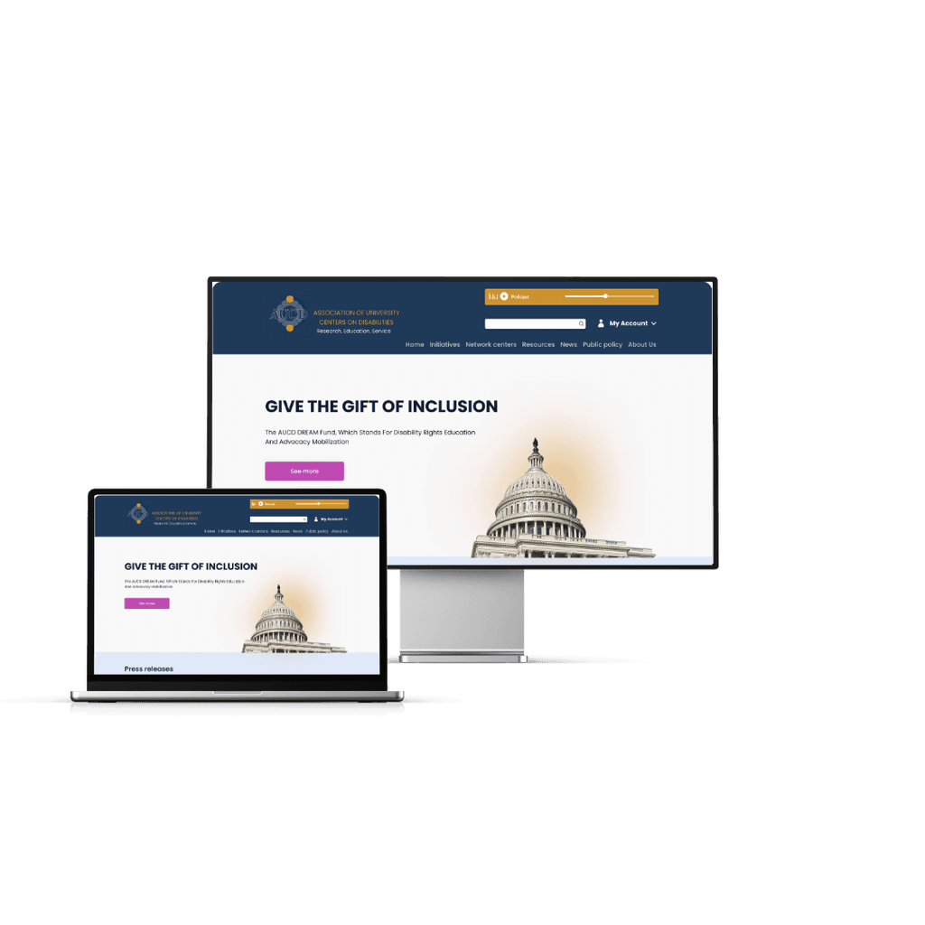
AUCD Website Redesign: Creating a More Accessible and User-Friendly Platform
This project addresses the issues the current website is facing and provides solutions to make the website more accessble and easy to navigate. It aims to educate users about the current challenges and create awareness about the institution.
Project type
tools
Academic
ROLE
UX Designer
project duration
1 month
Project description
AUCD is a resource for agencies, organisations and policy makers who are interested in people with developmental and other disabilities and their families to find connections and lead a healthy life.
Its goal is to support members' participation in research, education, health, and service endeavors in order to advance policies and practices that enhance the social, economic, educational, and health well-being of all individuals with developmental and other disabilities, their families, and communities.
The problem
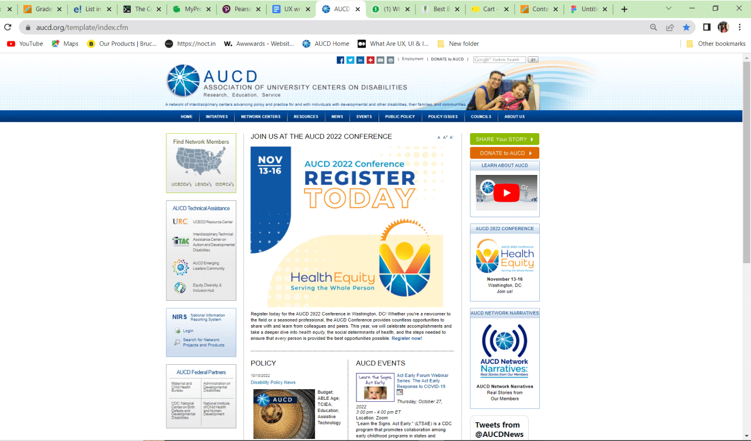
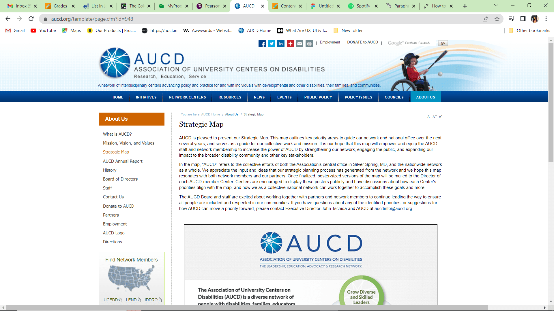
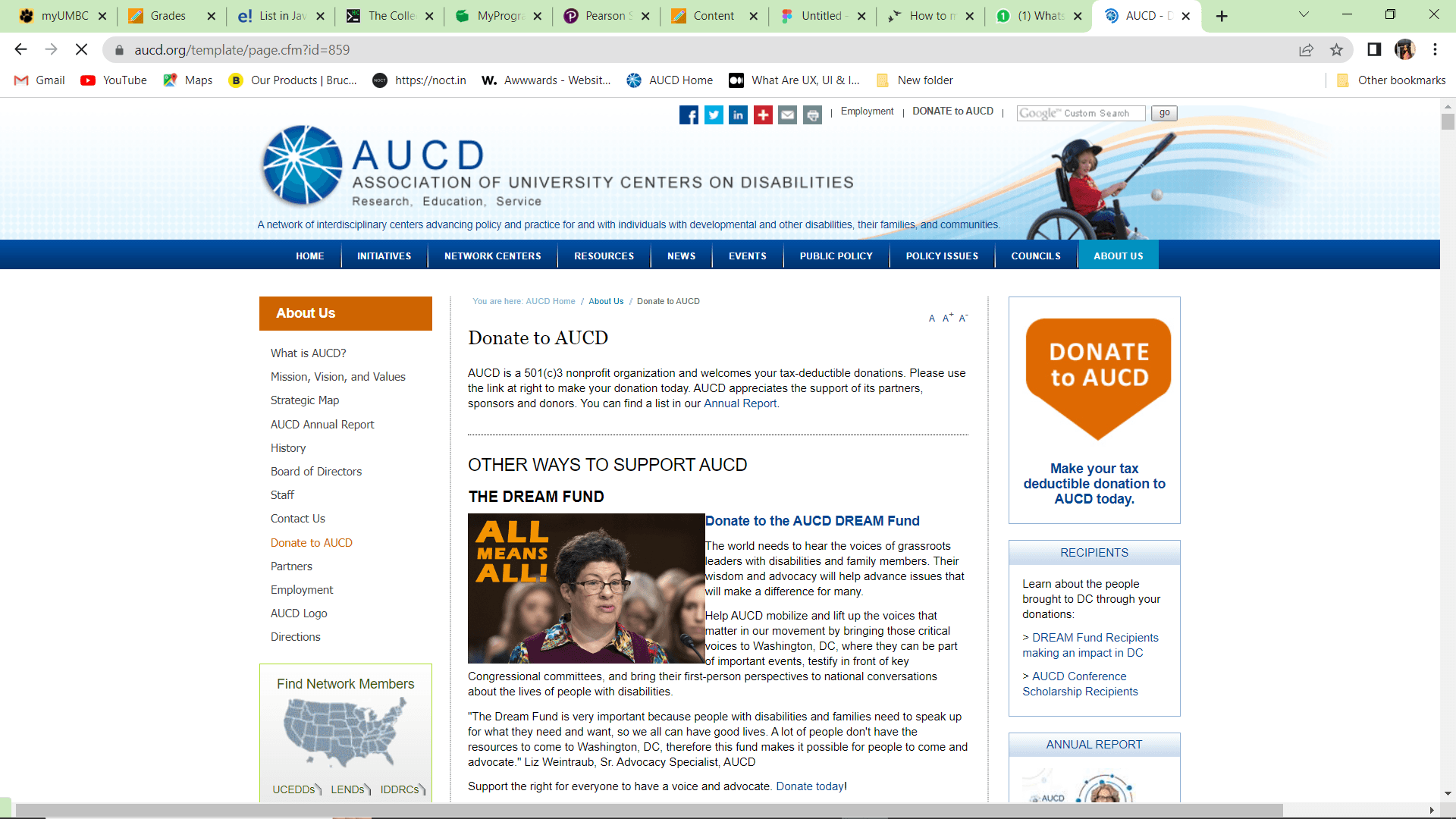
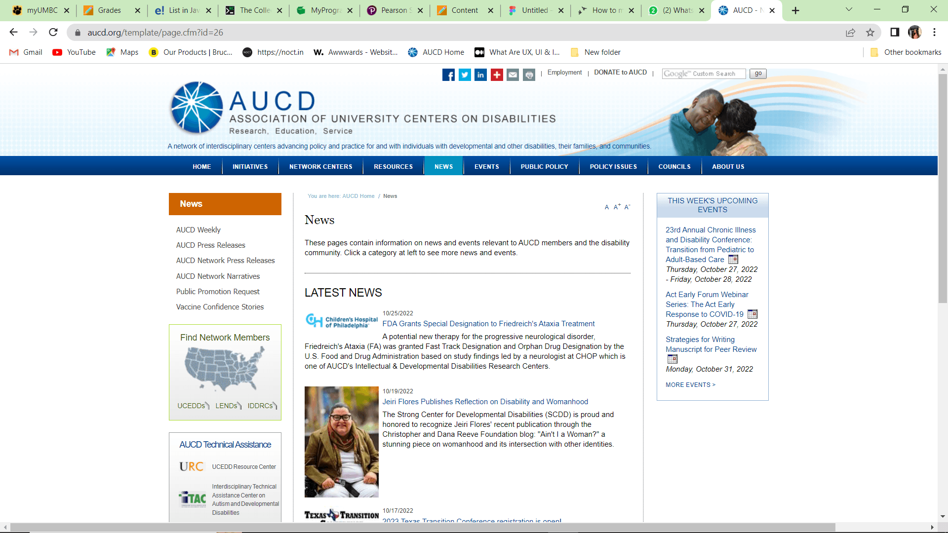
The current interface is not accessible for users with disabilities due to lack of icons, lots of small text, and excessive white space, making it difficult to navigate and find important information.
Old website
01
Problem Statement
The interface lacks user-friendliness for those with disabilities. The presence of numerous empty white spaces, coupled with large icons and small text fonts, makes it challenging to locate information.
02
Solution
Organize the information in a clearer way, making the text and icons easier to see, and using colors that are more comfortable for everyone.
The goal is a friendlier and more accessible design that makes it simpler for everyone, especially those with special needs, to find information and connect with others.
03
Research
Conducted market research to identify existing scheduling challenges and user preferences. Defined target audience segments and outlined key features based on user needs and market trends.
04
Design
Collaborated with designers to create intuitive user interfaces and interactive prototypes. Iteratively refined designs based on user feedback to enhance usability and visual appeal.
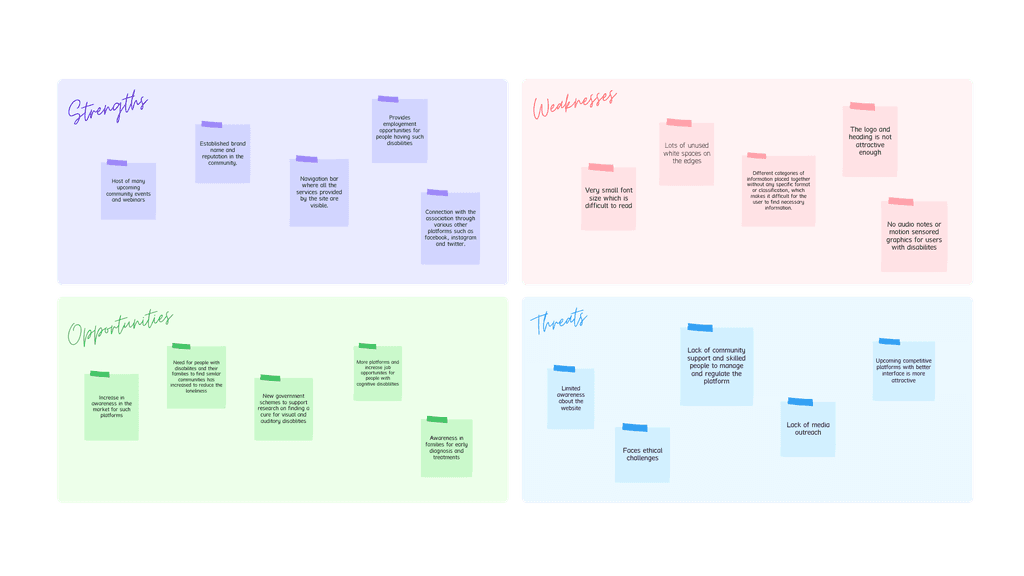
SWOT analysis
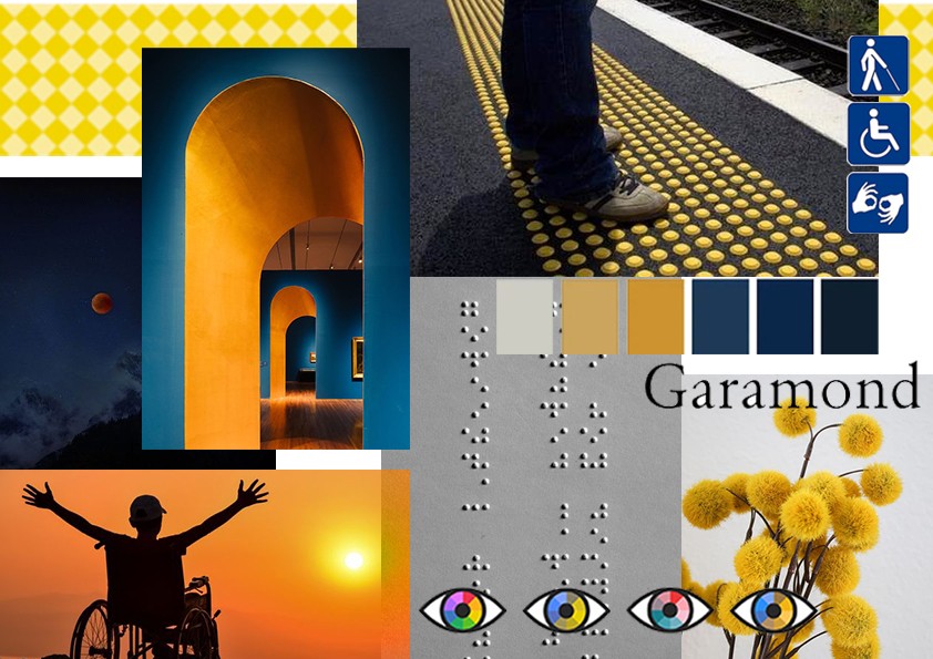
Mood board
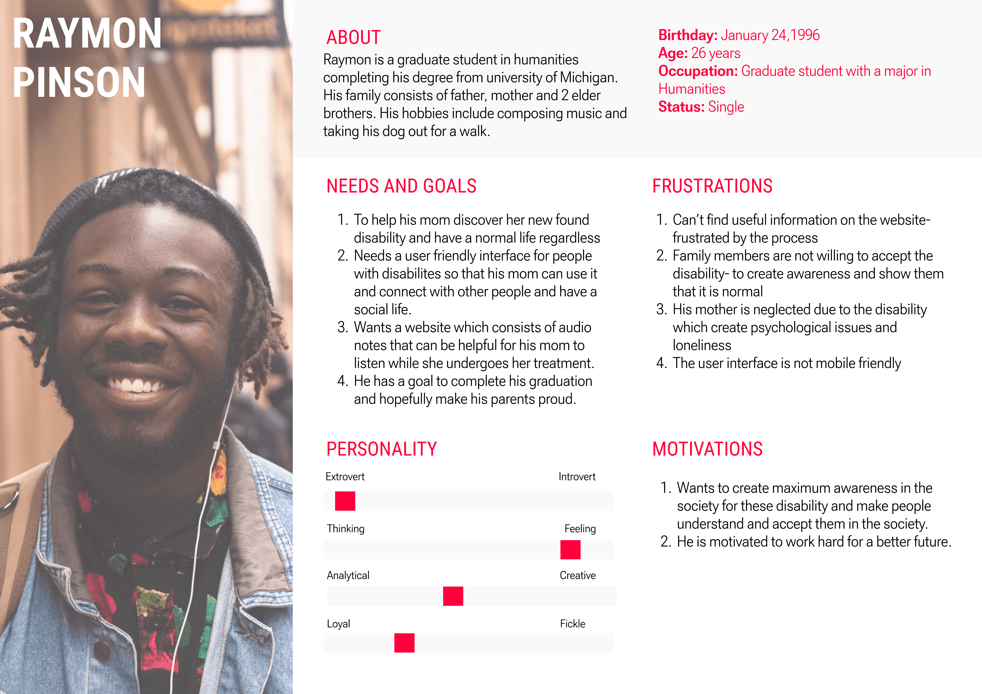
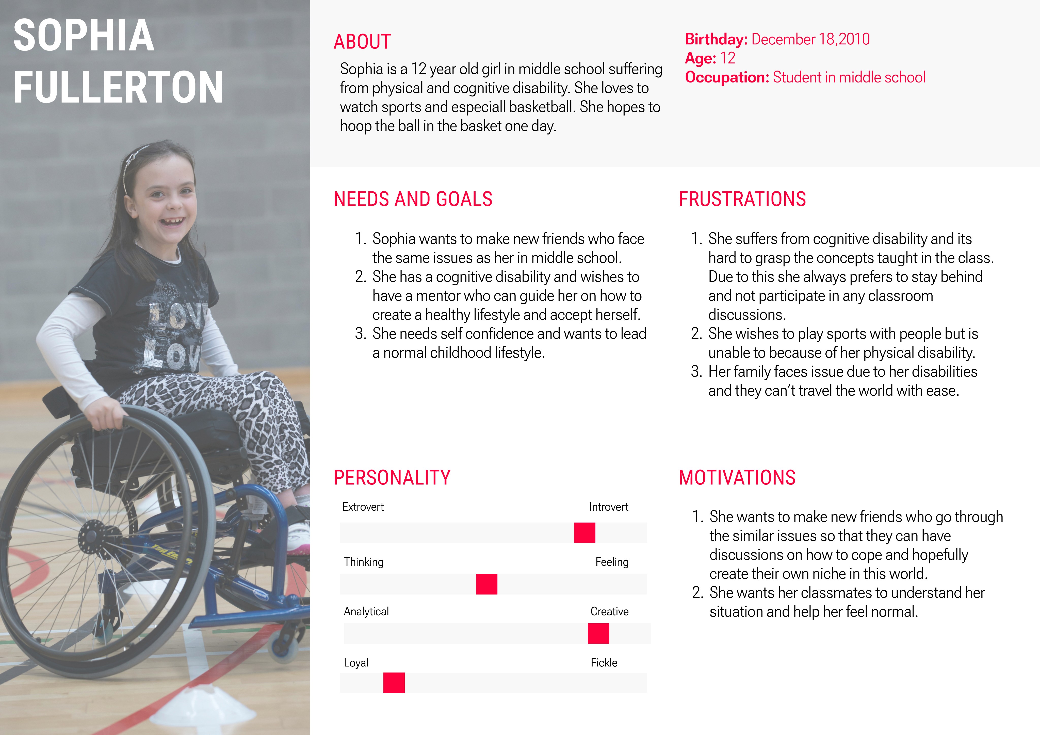
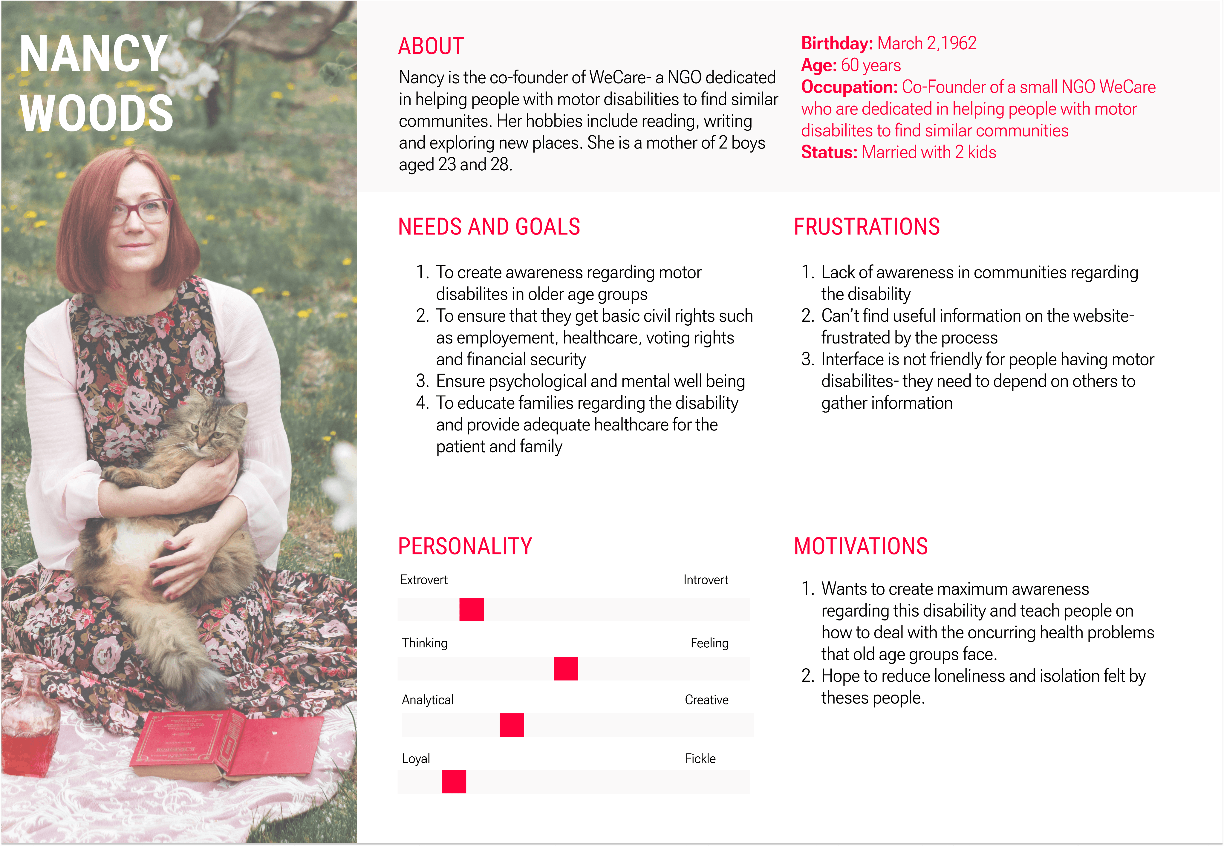
User Personas
Site map
Before coming up with ideas and sketches, I created a sitemap to decide what features and pages would be most helpful for users. The structure I settled on is based on the research and what could be the best for the platform.

Low fidelity mockups

Result
Transitioning from mid-fidelity designs, we ventured into the high-fidelity phase. Here, we added the finishing touches to the visuals, incorporating precise details, colors, and realistic elements. High-fidelity designs are like the polished version of our initial sketches, providing a comprehensive and visually appealing representation of the sign language application. These designs serve as the blueprint for development, ensuring that the final product aligns with our vision for an engaging and user-friendly experience.
Hi fidelity prototypes

Homepage:
Streamlined Navigation: I reorganized the navigation bar to make it clearer and more intuitive, allowing users to quickly find the resources and information they need.
Reduced Clutter: By minimizing excessive white space and balancing text with visual elements, I made the homepage more engaging and easier to digest.
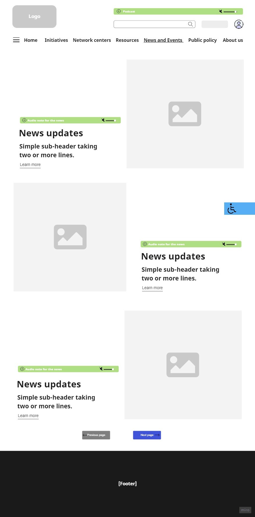
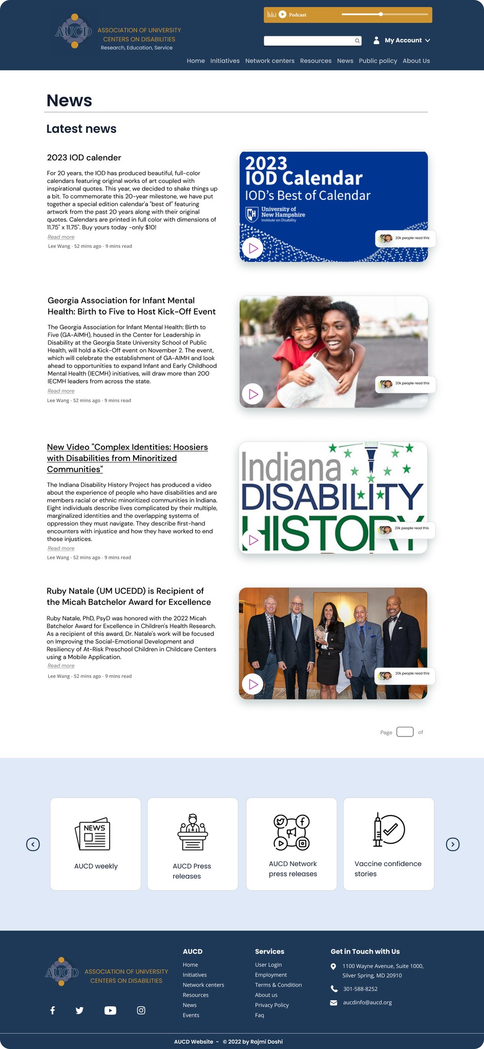
News and Events:
Visual Clarity: I introduced larger icons and cleanly structured layouts for news articles and event listings, with an emphasis on making text easy to read.
Interactive Features: Users can now sort events by date, type, or location, providing them with an intuitive way to browse and engage with upcoming activities.
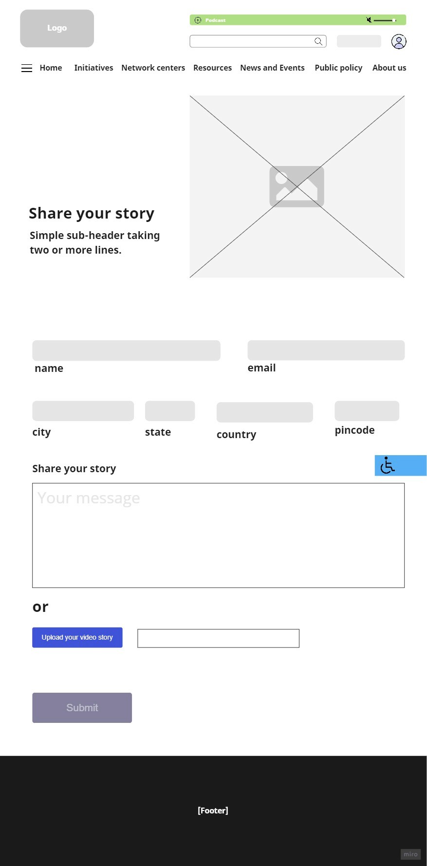
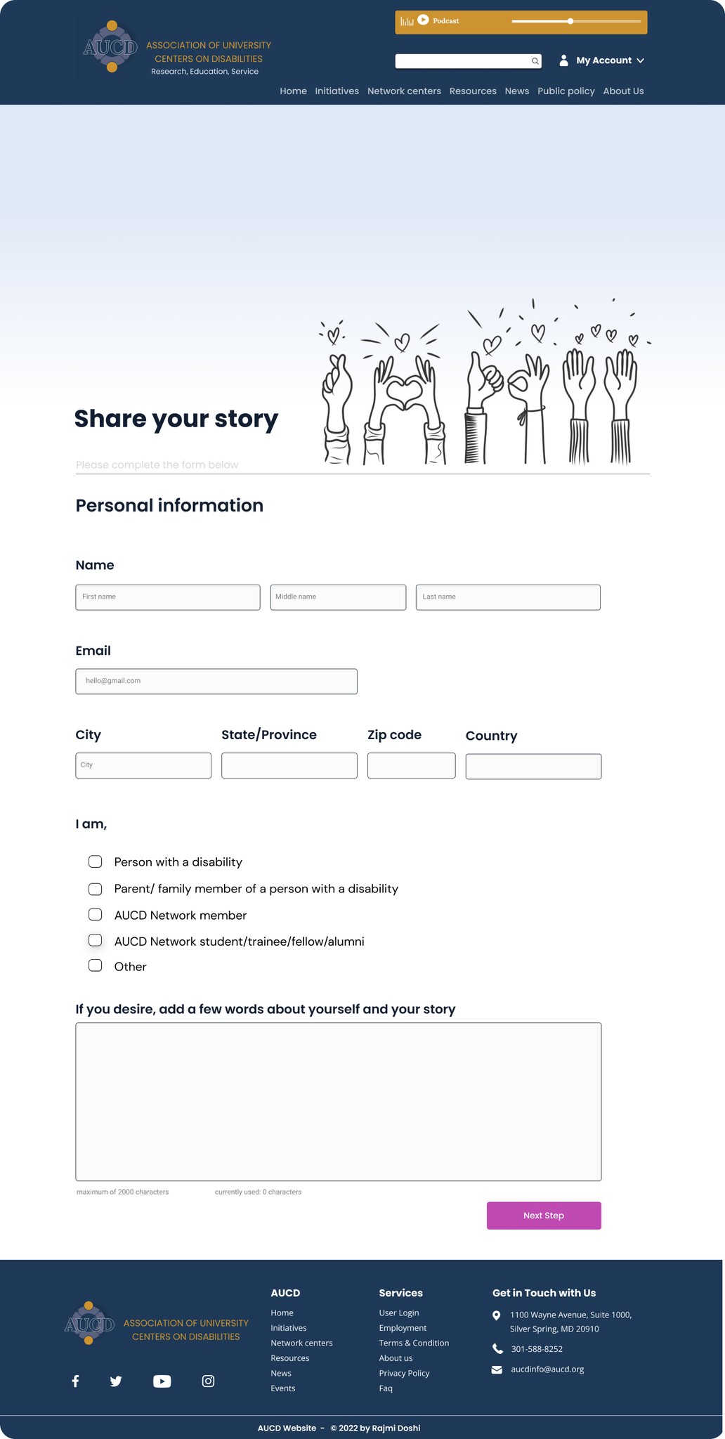
Share your story:
Simplified Submission Process: I designed a straightforward form layout with clear instructions, ensuring that users of all abilities can easily share their stories.
Accessible Form Design: All input fields were enlarged and labeled with accessible fonts, along with appropriate contrast to meet accessibility standards.
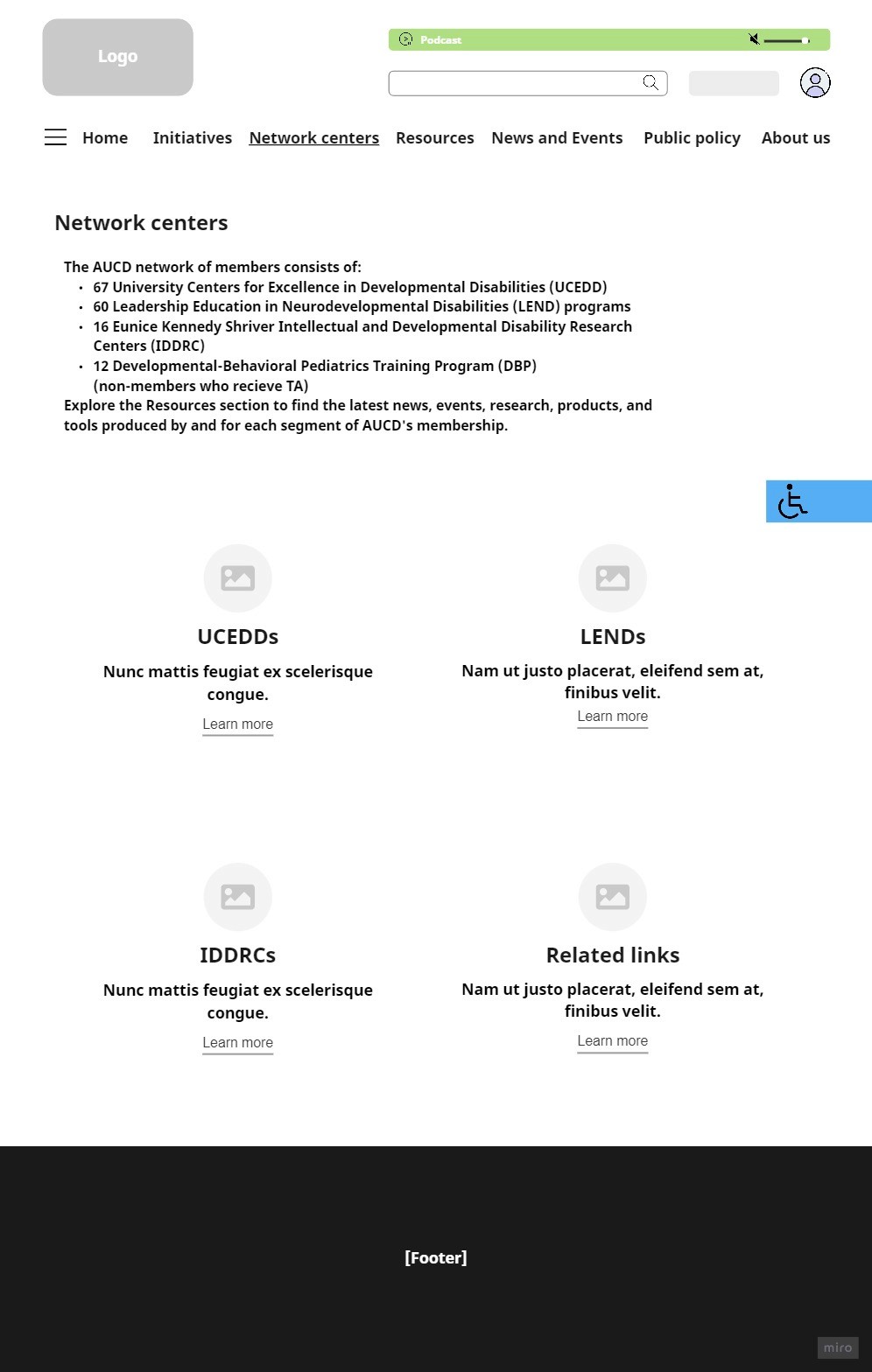
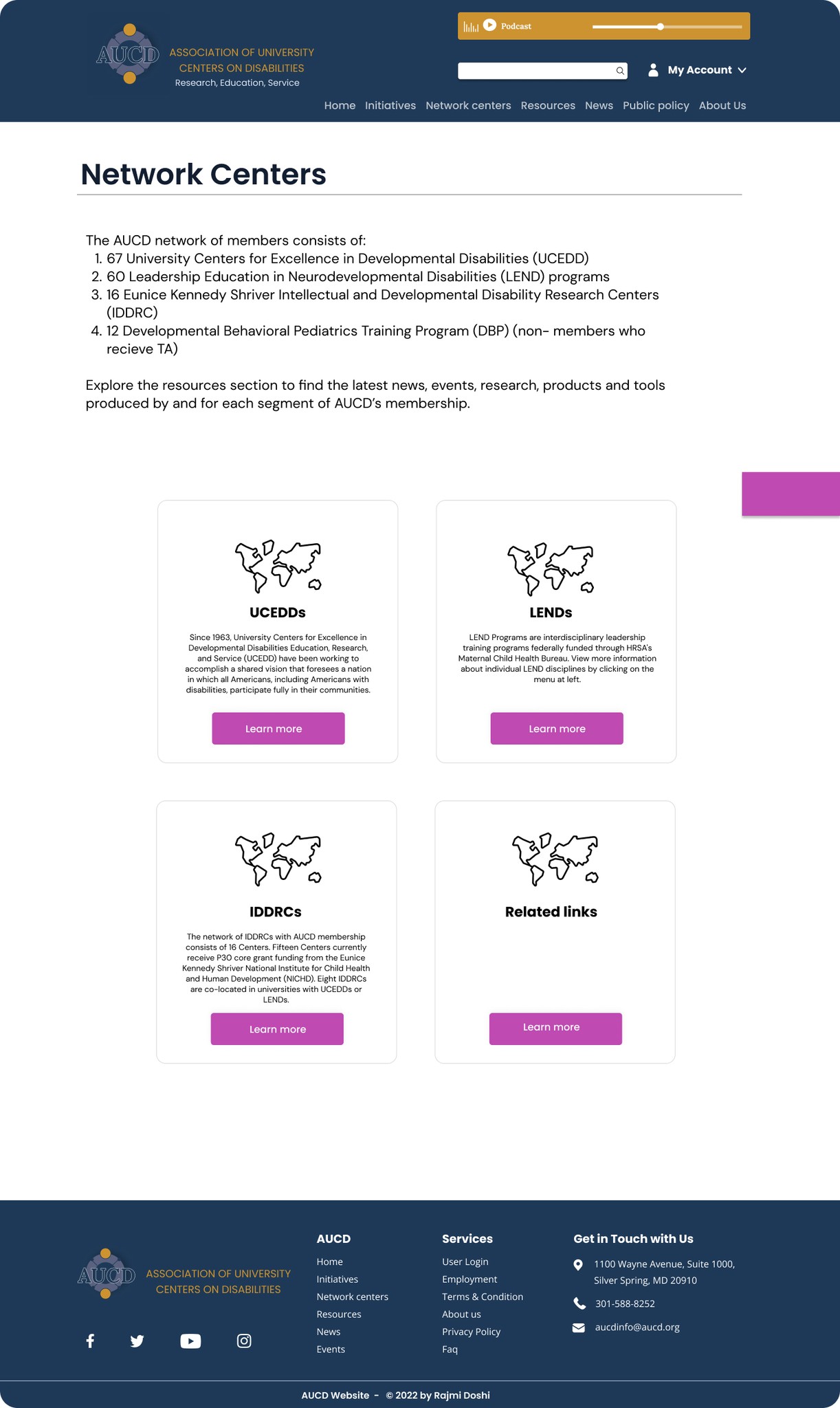
Network centers:
Clear Information Layout: I organized the center information into easy-to-read cards that display key details such as name, location, and contact information, allowing users to quickly scan and find relevant centers.
Map Integration: A dynamic map feature was added, helping users visually locate network centers and access directions with ease.
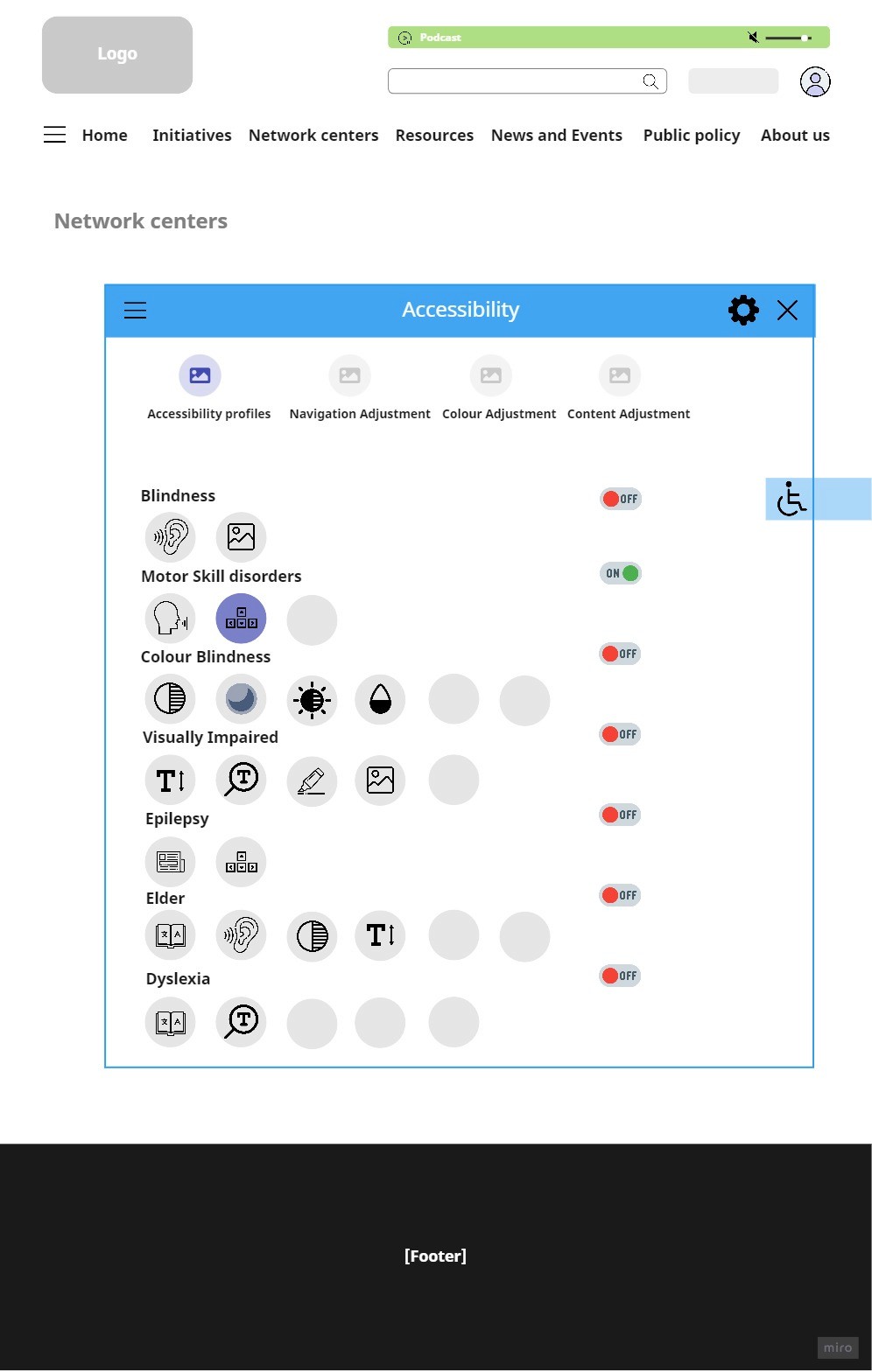
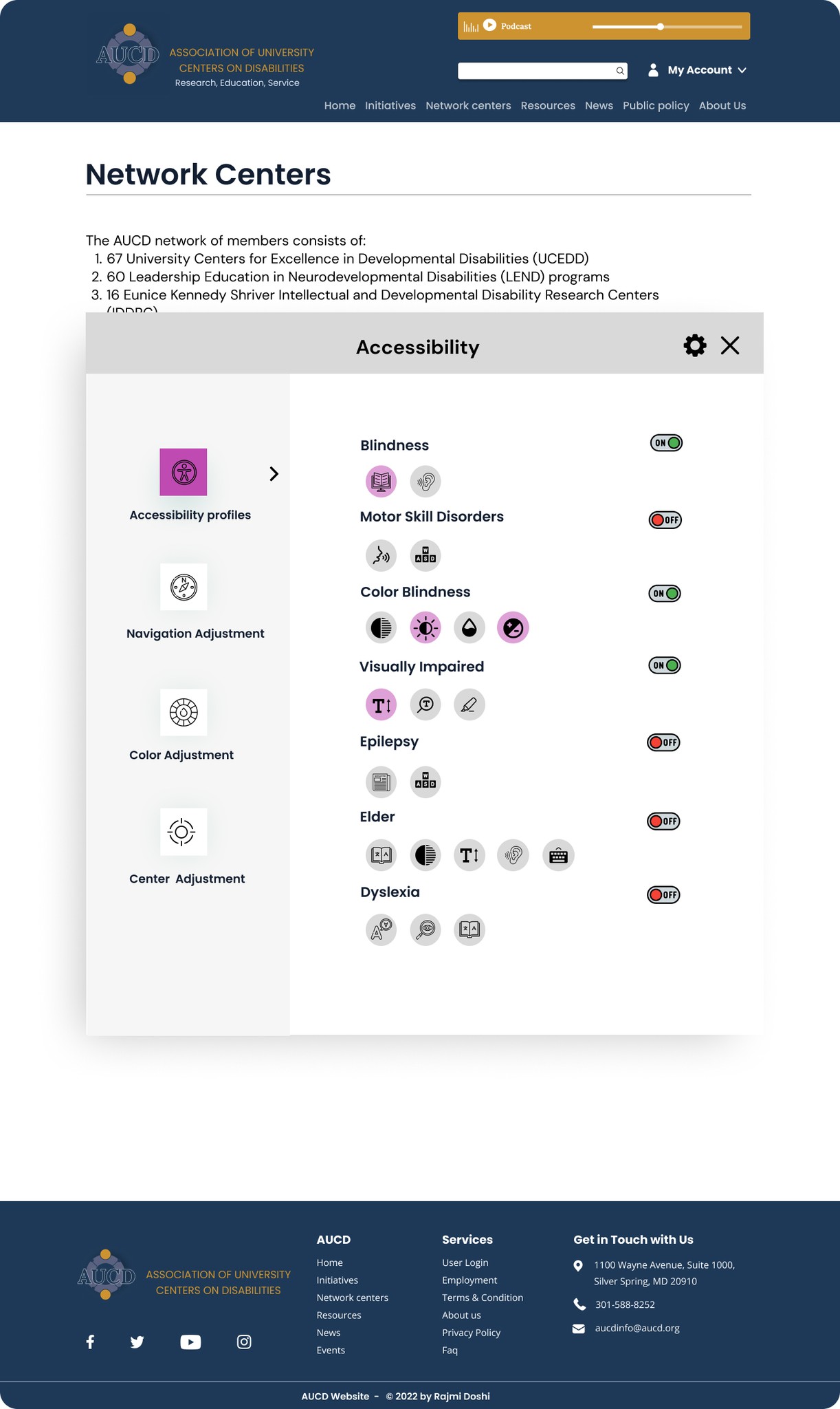
Accessibility button on Network centers:
The Accessibility Drop-Down Button on the Network Centers page made the website more inclusive by allowing users to customize text size, contrast, color schemes, and screen reader settings. This improved readability, navigation, and overall user experience for individuals with visual, cognitive, and mobility impairments, ensuring easier access to essential information.
Learnings
Recognizing challenges faced by users with special needs, the main goal became redesigning for better accessibility. Learning from research, I decided on essential features and pages, organizing the platform logically based on a user-friendly sitemap.
Breaking it down, my focus was on redesigning key screens: Homepage, News and Events page, Network Centers, Share Your Story page, and introduced an Accessibility page. The changes were all about simplifying things – adjusting fonts, organizing content, and choosing better colors. I aimed for a design which is clear for everyone.
This hands-on experience not only improved my understanding of visual design, UX processes, and UX writing but also provided insights into the flow of how websites work. The process highlighted the importance of collaboration and iterative decision-making. The goal is to create a platform that not only meets the specific needs of some users but provides a universally enjoyable and inclusive experience for all. I wished to work more on the project but the time constraint was an issue as it was a 4 month long class project.
Logo
Typography and Icons
UI kit:
Color palette
Aa - Heading 1 Poppins SemiBold
Aa - Heading 2 Poppins Regular
Aa - Body Open sans Regular
Learn more
Learn more
#A0A6B7
#1E3957
#CD9330
#C453B7
SWOT analysis
